

Rebrand & Identity Evolution
Venom Protein Australia had built a solid following in the local sports nutrition market when the CEO laid out plans to push into China and Asia. The pitch got stopped mid-presentation when the trademark attorney cut in with a hard truth: Venom translates to "poison" in most languages. For a brand selling health and performance products, that was a non-starter.
Role
Creative Lead
Scope
End to End Campaign
Deliverables
Logo Redesign
Brand Guideline
Year
2017
The Challenge
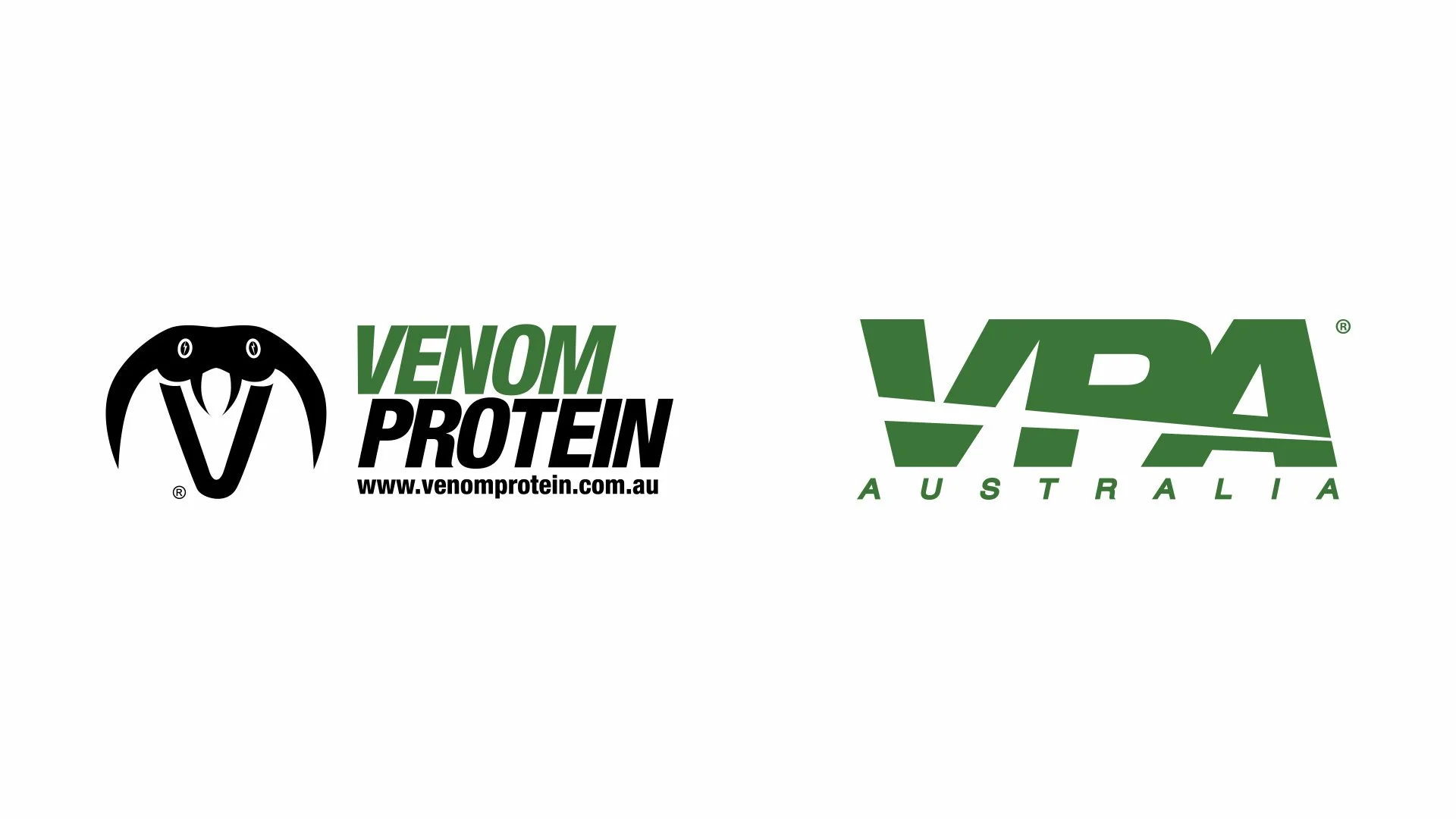
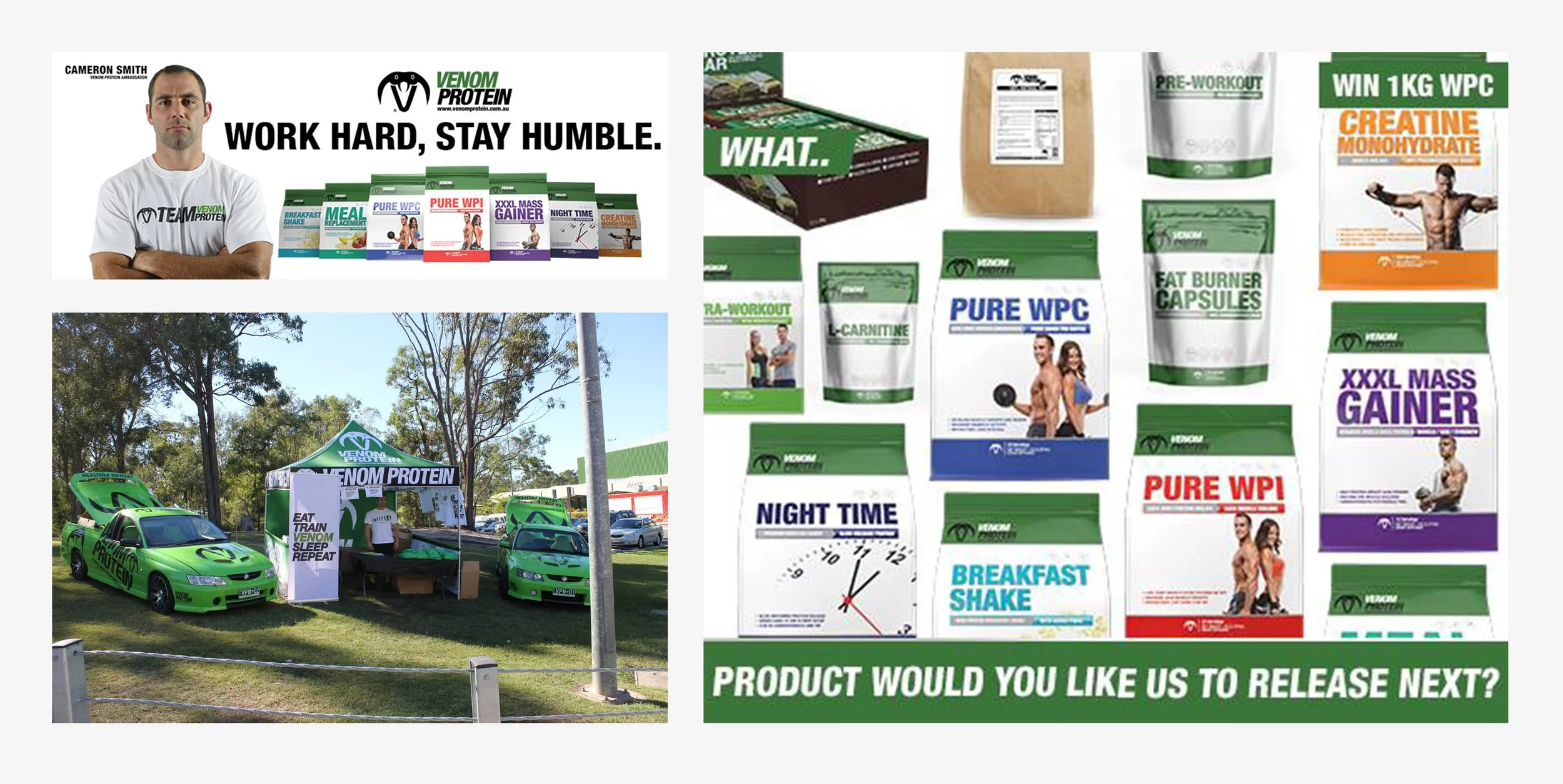
The brief was straightforward on paper, rename and rebrand, but the real problem was more delicate. Venom Protein had a loyal customer base and a recognisable identity built around a combination mark: a custom V icon shaped like a cobra's head paired with a clean Helvetica wordmark. Black and green. Built over years. The CEO didn't want to throw that away. The goal was evolution, not erasure. The new identity had to feel like a natural next step rather than a complete reinvention, while also being clean and neutral enough to work in markets the brand hadn't entered yet.
The Approach
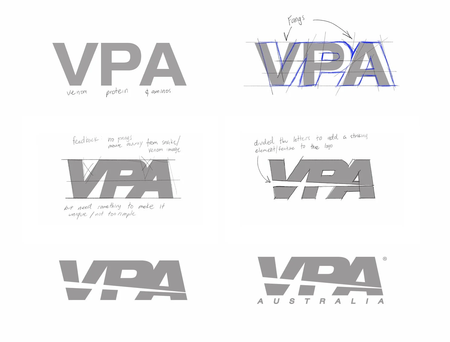
The answer was already sitting in the problem. Abbreviating to VPA (Venom Protein & Aminos) kept the brand's history intact while giving it a name that could travel globally without baggage. Enough continuity to keep existing customers on side, without locking the brand to imagery that would hold it back.
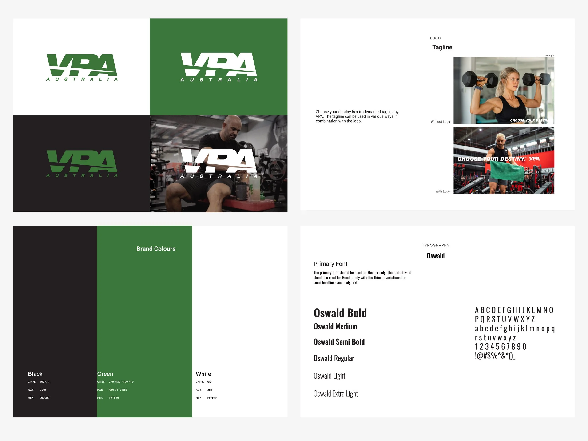
The cobra icon was too tied to the old name to survive the change, but the green wasn't. That colour had become genuinely associated with the brand, and carrying it forward gave customers something familiar to anchor to. A clear signal that this was the same brand moving forward, not a different one starting over.
The launch tagline, Choose Your Destiny, since trademarked, gave VPA a rallying point that felt aspirational without carrying the aggression of the old name.
The rollout was deliberately paced. Existing packaging stock was run down before new branding came in, a practical cost decision that also made the transition feel gradual rather than jarring. The name change was treated as a story to share across every touchpoint for the full year of transition, not something to quietly slide past people.
The Solution
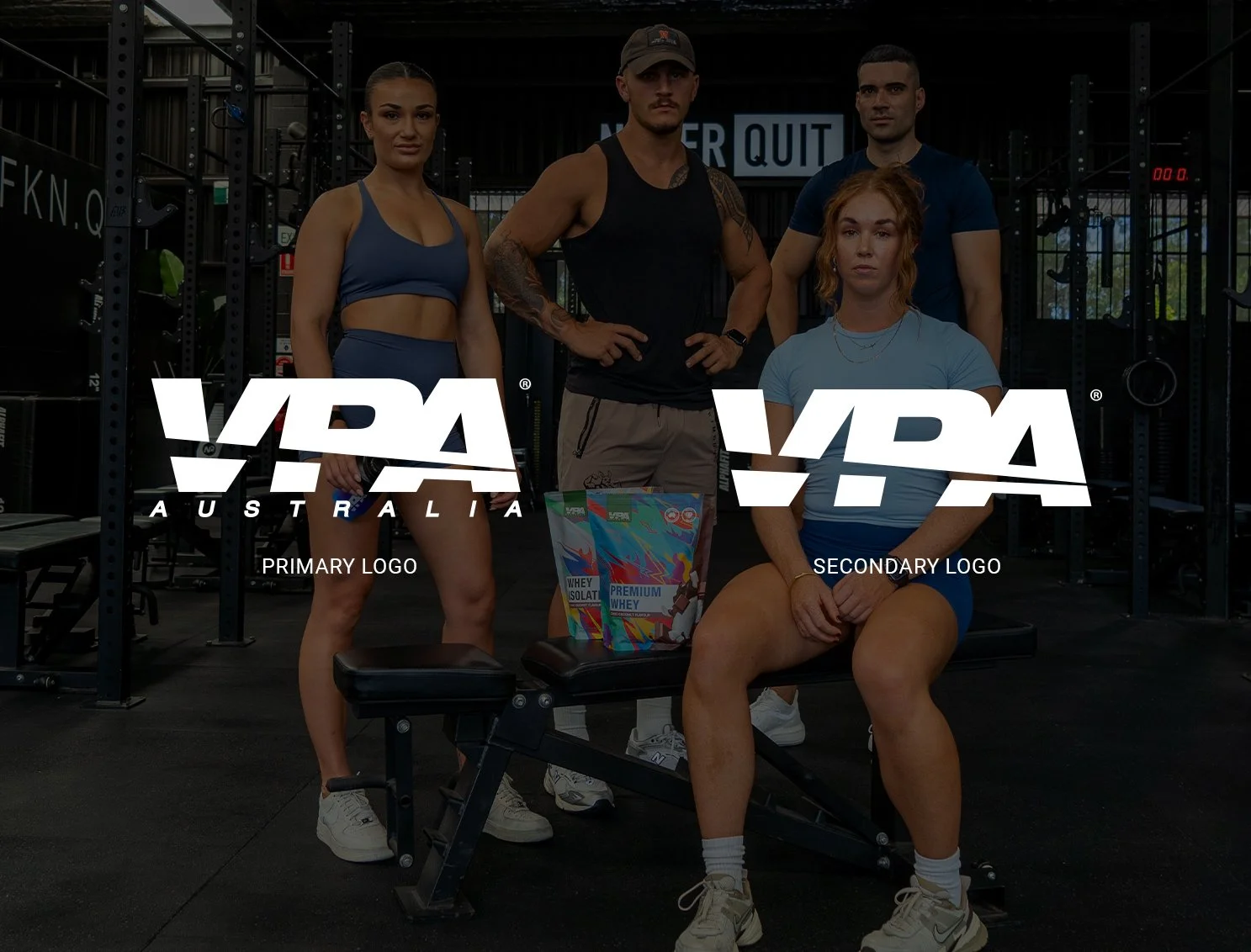
The new identity centred on a primary logo combining a bold VPA wordmark with "Australia" sitting underneath, a deliberate choice to plant the flag on the brand's origins as it pushed into international markets. A secondary wordmark-only version gave the brand flexibility across applications. Oswald and Roboto were established as the type system across web, social, email, and marketing, giving VPA a consistent voice to match the new mark.
The Outcome
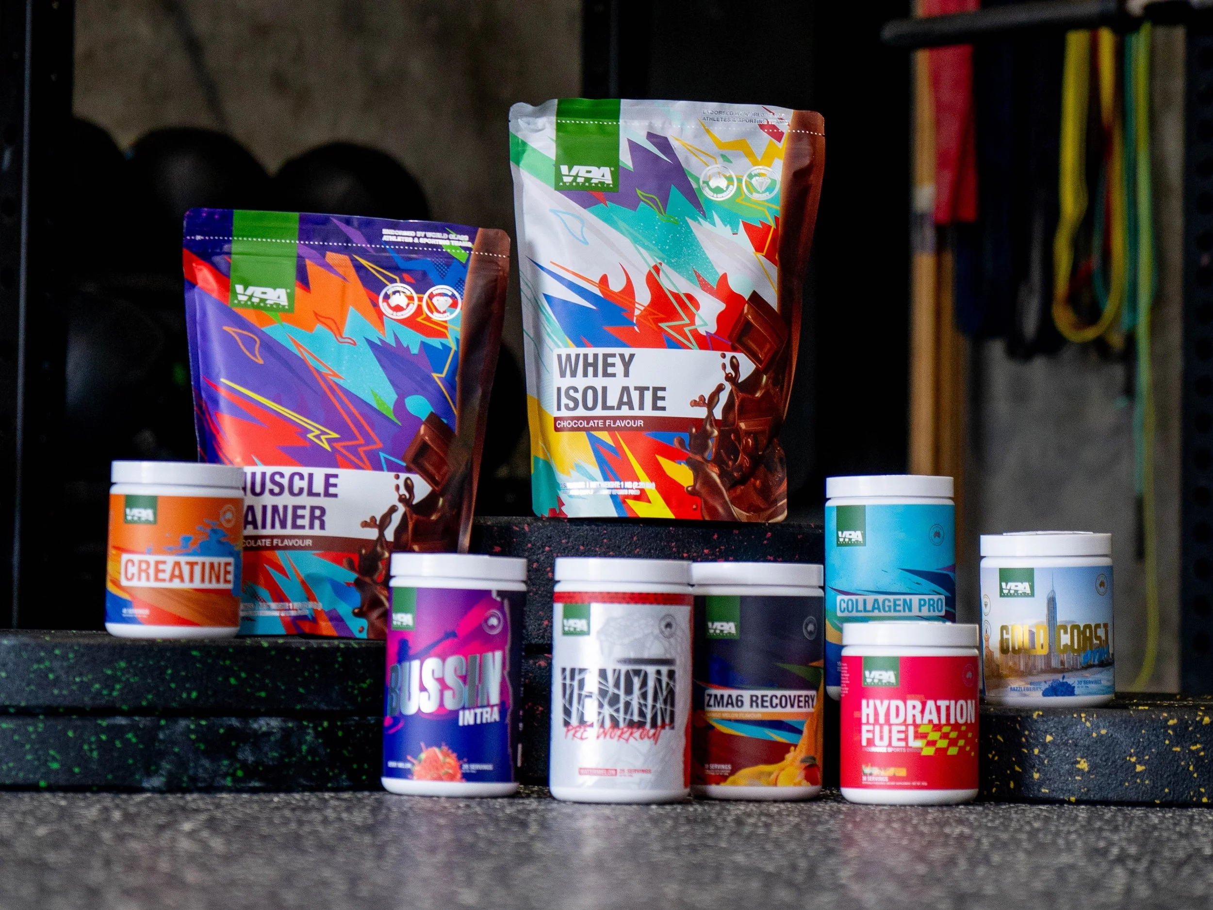
The rebrand avoided the customer backlash that name changes often trigger. VPA grew in the years that followed, expanding its product range, redesigning packaging, and establishing itself as a leader in the Australian supplement market. Since 2019, VPA has been awarded the top-rated Australian protein and supplement brand eight years running.