

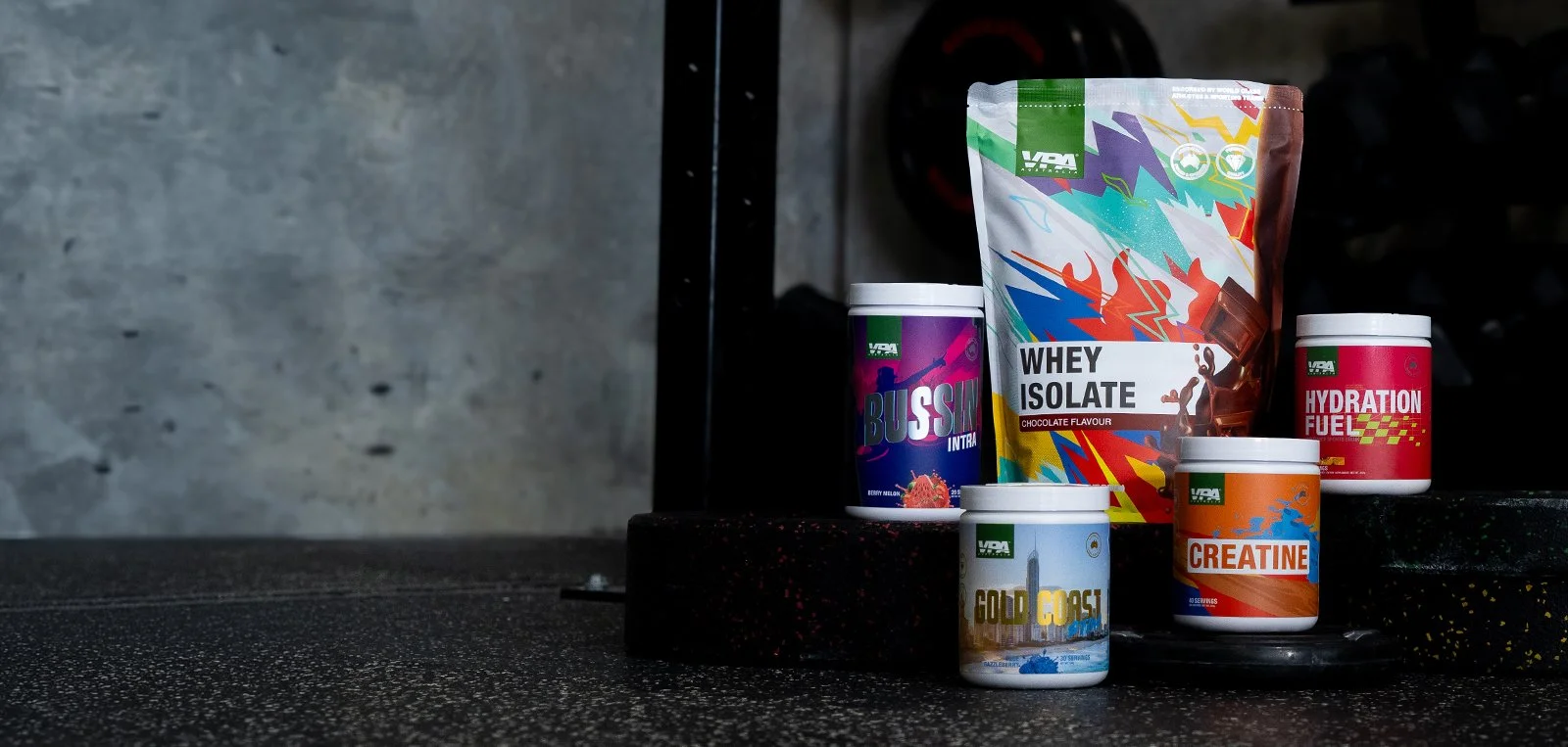
Brand Refresh & Packaging Redesign
Role
Creative Lead
Year
2023-2024
Scope
Redesign and Campaign
Deliverables
Packaging Redesign
Marketing campaign
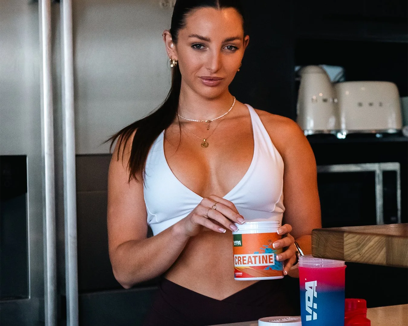
Photo and Videos
VPA had spent years building credibility in the Australian supplement market on the back of a clean, minimal aesthetic. By 2023, that aesthetic had become a liability. The category had caught up, and what once felt premium now felt generic. The brief was to push the brand into bolder visual territory without losing the trust it had spent a decade earning.
The problem wasn't that the packaging looked bad. It looked fine, which was exactly the issue. Across a crowded supplement shelf, fine is invisible. Competitors had converged on the same restrained, clinical visual language, and VPA was getting lost in it. The new direction had to do two things at once: stand out boldly enough to stop someone mid-scroll or mid-aisle, while still feeling like a brand worth trusting with your health and performance goals.
The Challenge
Redesign of protein bag packaging from a plain minimalistic design to a bold new visual direction
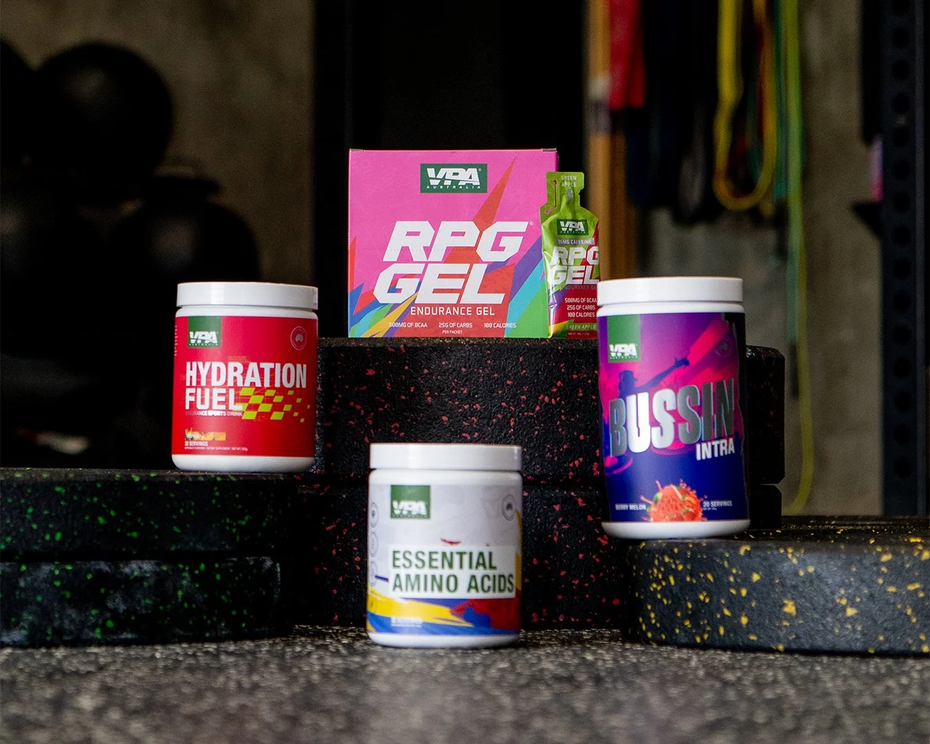
Redesign of bottle labels to align with the refreshed packaging system
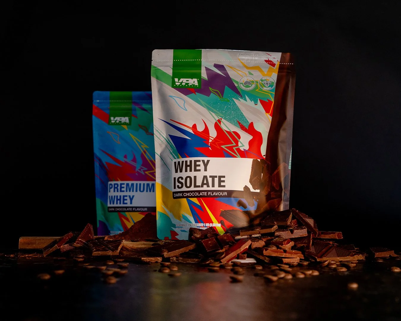
Planning, organising, and directing product/content photography shoots
Deliverables
The Approach
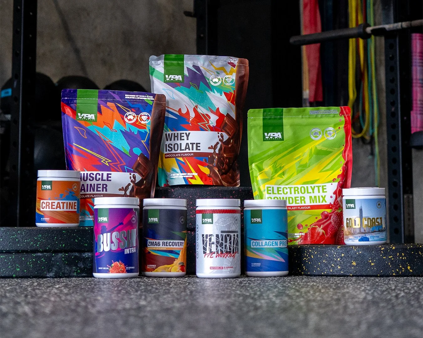
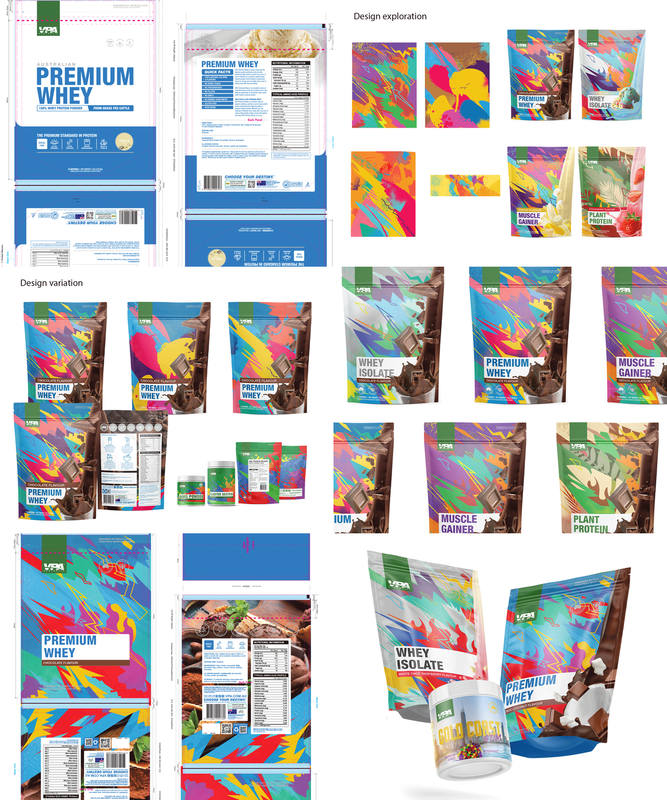
The research phase looked hard at where the category was heading and where the gaps were. Most brands were doubling down on minimalism. The opportunity was to go the other way. The new direction moved toward bold colour, strong typographic architecture, and flavour-forward imagery that made the product feel as good as it tasted. Every design decision was made against a simple test: does this own the shelf, or does it blend in?
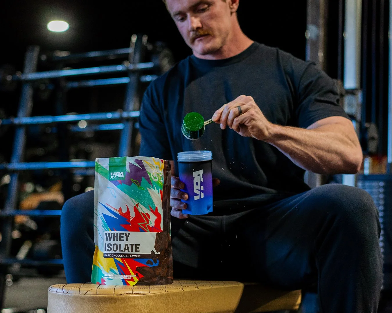
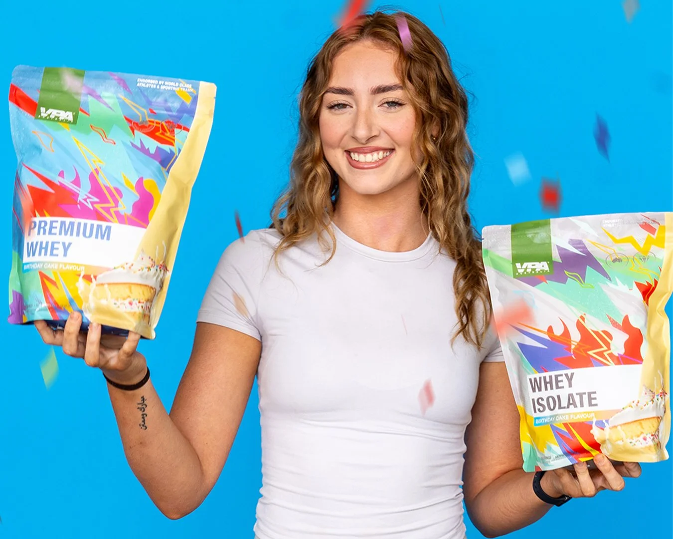
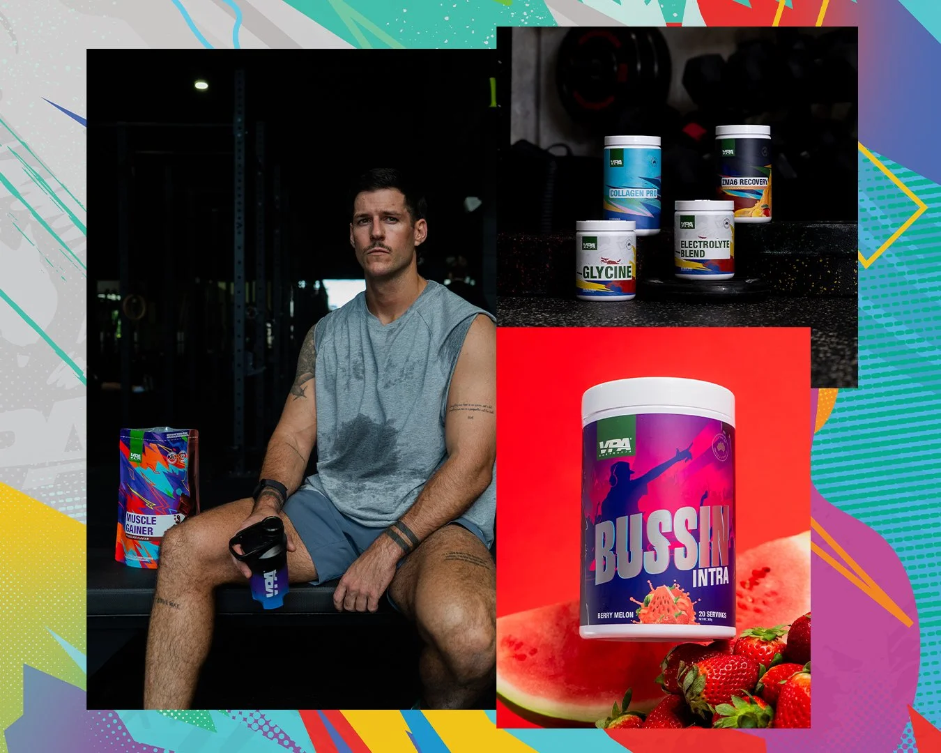
The rollout covered over 10 bag formats and more than 20 bottle labels, each requiring its own application of the system while maintaining coherence across the range. Alongside the packaging, I planned, art directed, and shot the product and content photography, building a visual library that carried the new direction across digital, social, and campaign assets.
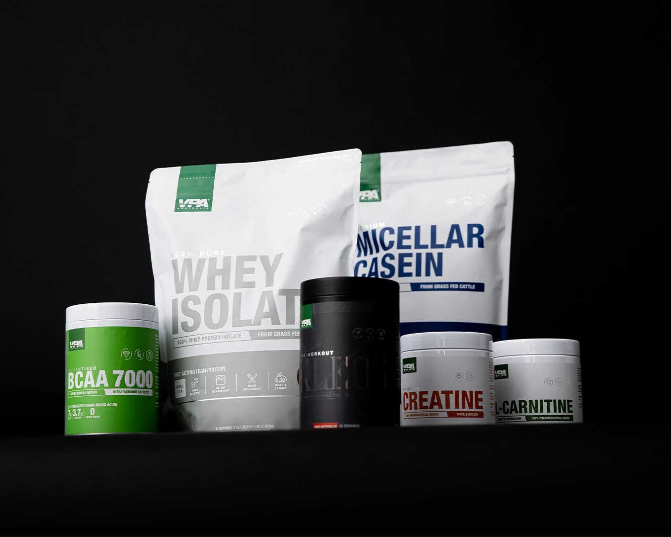
Old Packaging
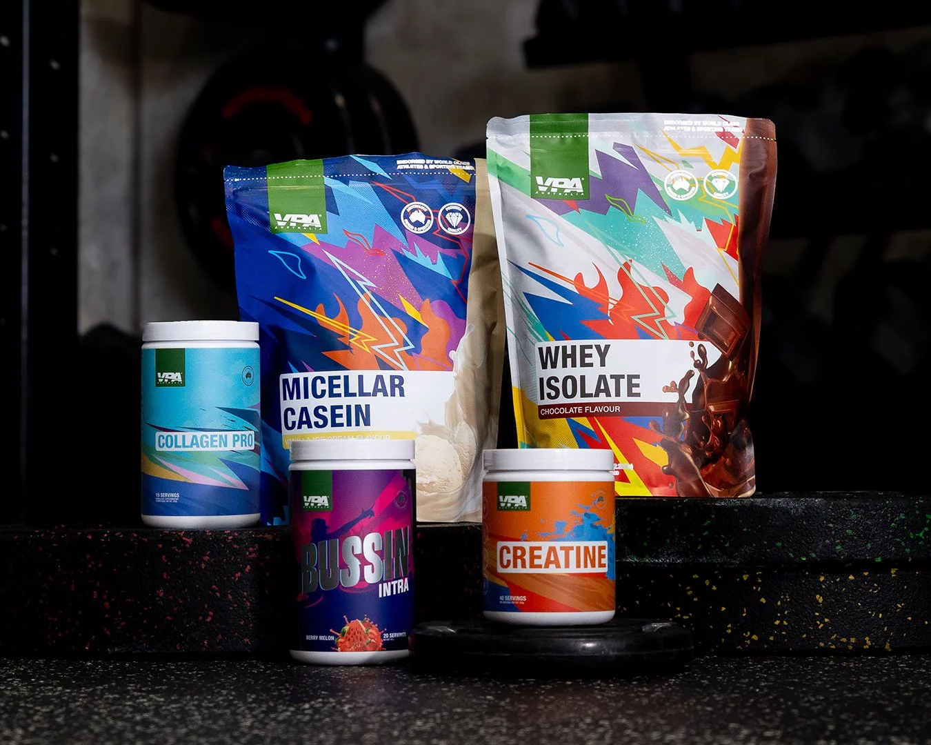
New Look Packaging
The finished system replaced the brand's neutral palette with a bold colour architecture, each flavour given its own identity within a consistent structural framework. Flavour imagery moved to the hero position, giving customers a sensory reference point that the old packaging never offered. The typography was tightened and given more authority, so the brand read confidently at small sizes and large format alike.
The Solution
Outcome
The refresh gave VPA a presence it hadn't had before at shelf and online. The brand has continued its year-on-year revenue and profit growth since the relaunch, and VPA has held its position as Australia's top-rated supplement brand for eight consecutive years.