

Product Design & Campaign:
Performance Socks
Role
Lead Creative
Year
2025
Deliverables
Product
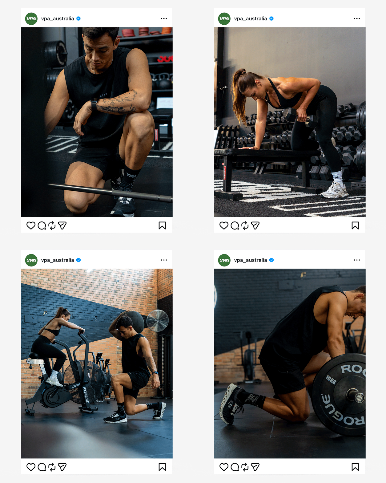
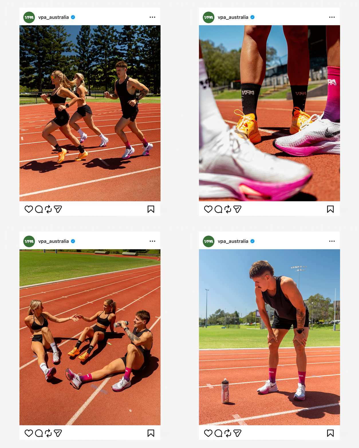
Marketing Content
Photography
Scope
End to End Creative
The Challenge
The brief wasn't about solving a problem. It was about setting a new standard. VPA wanted a sock athletes would actually choose to race in, not just pull on for a casual gym session. That meant the construction, the branding, and the colourways all had to hold up under that expectation.
Approach
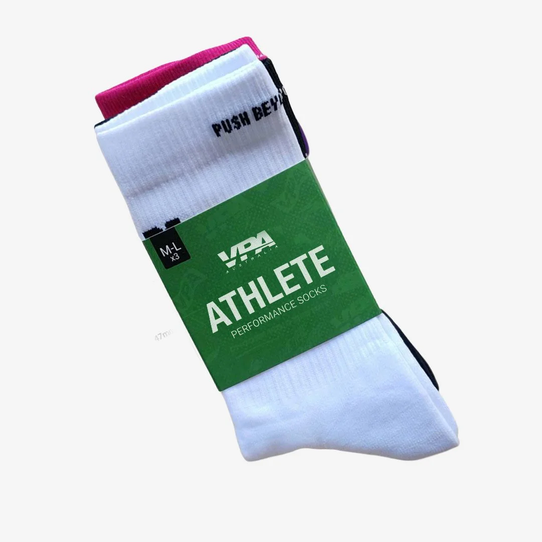
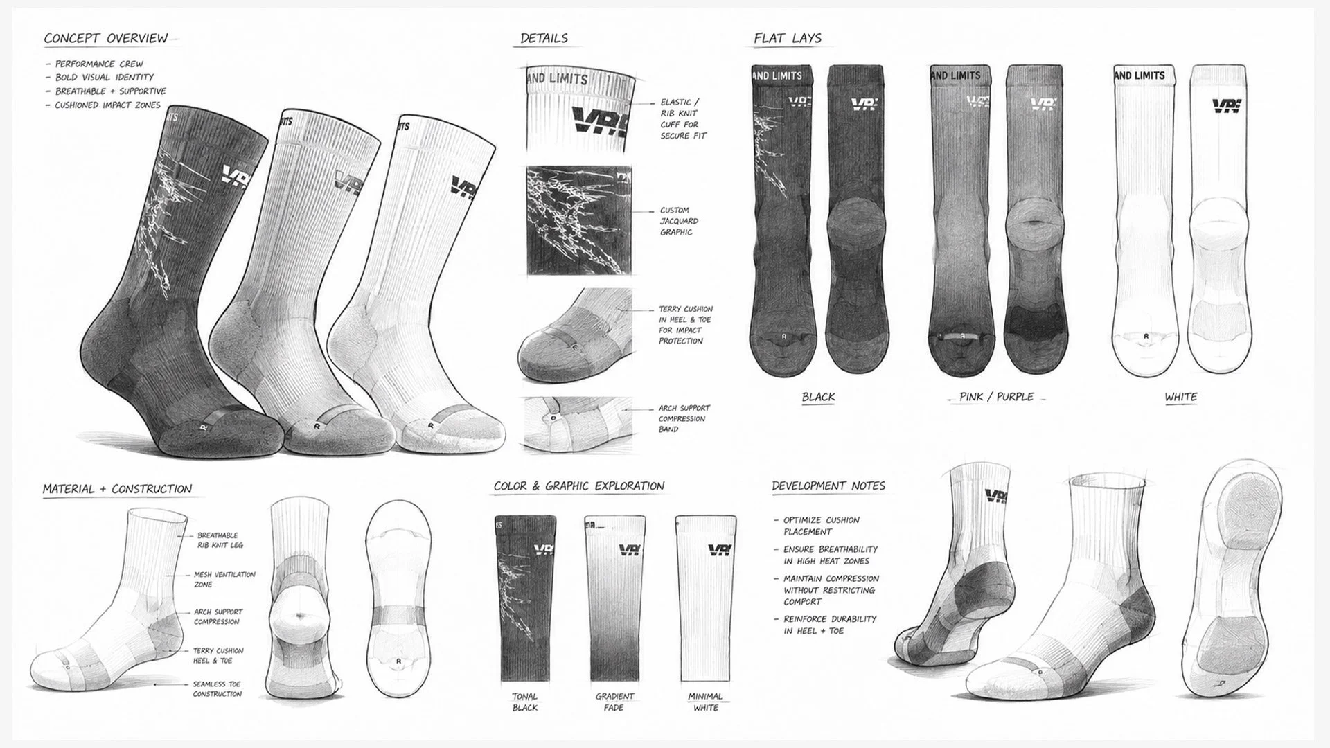
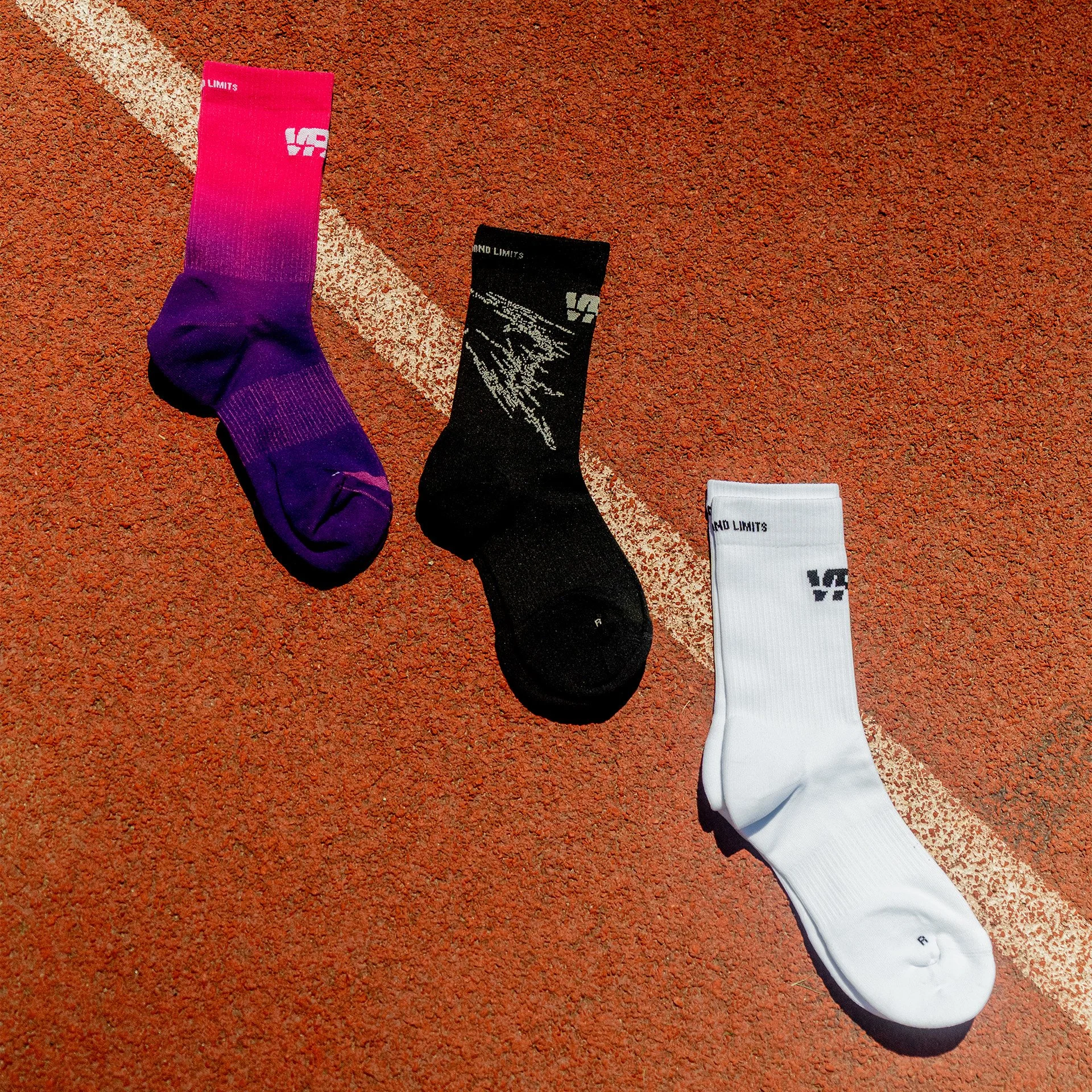
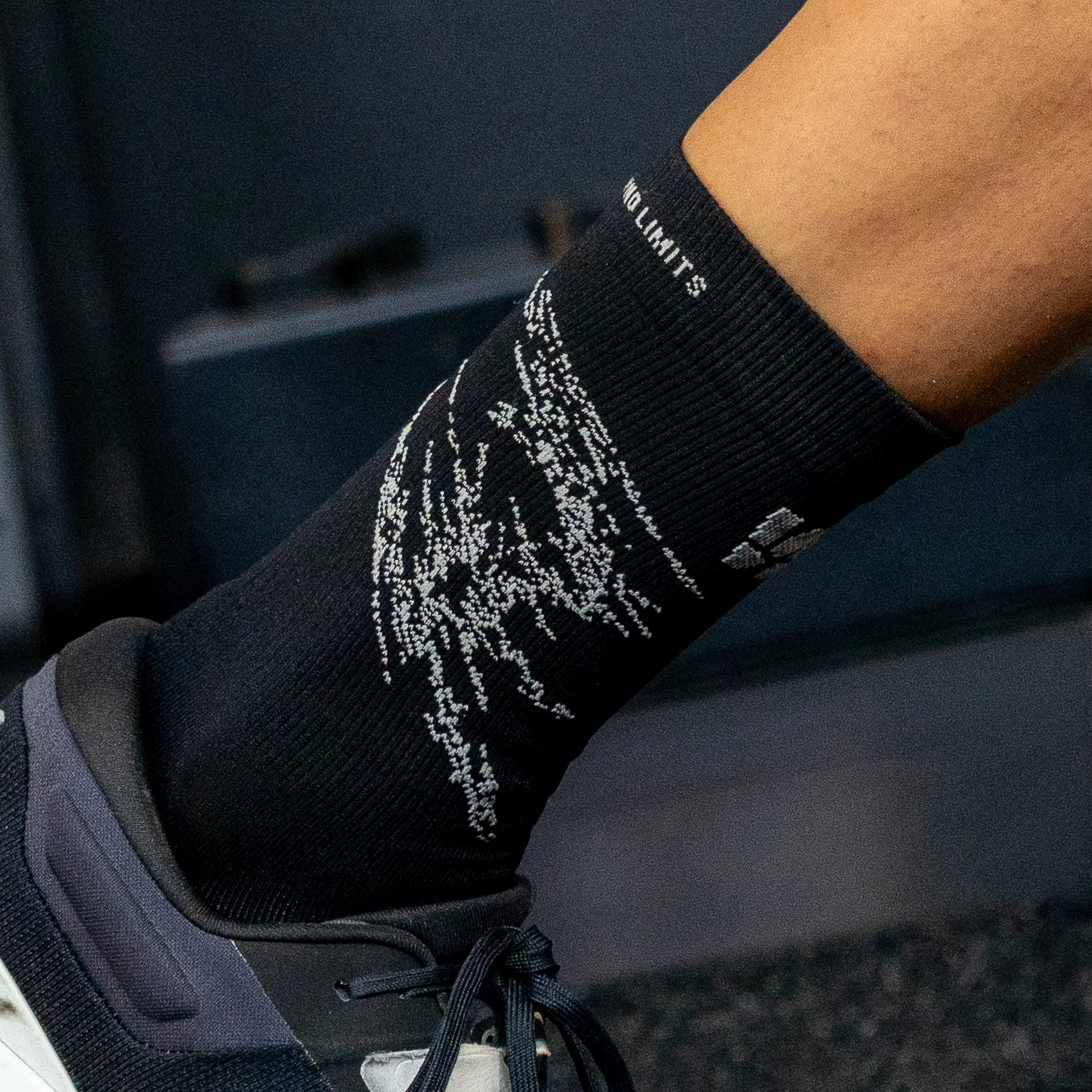
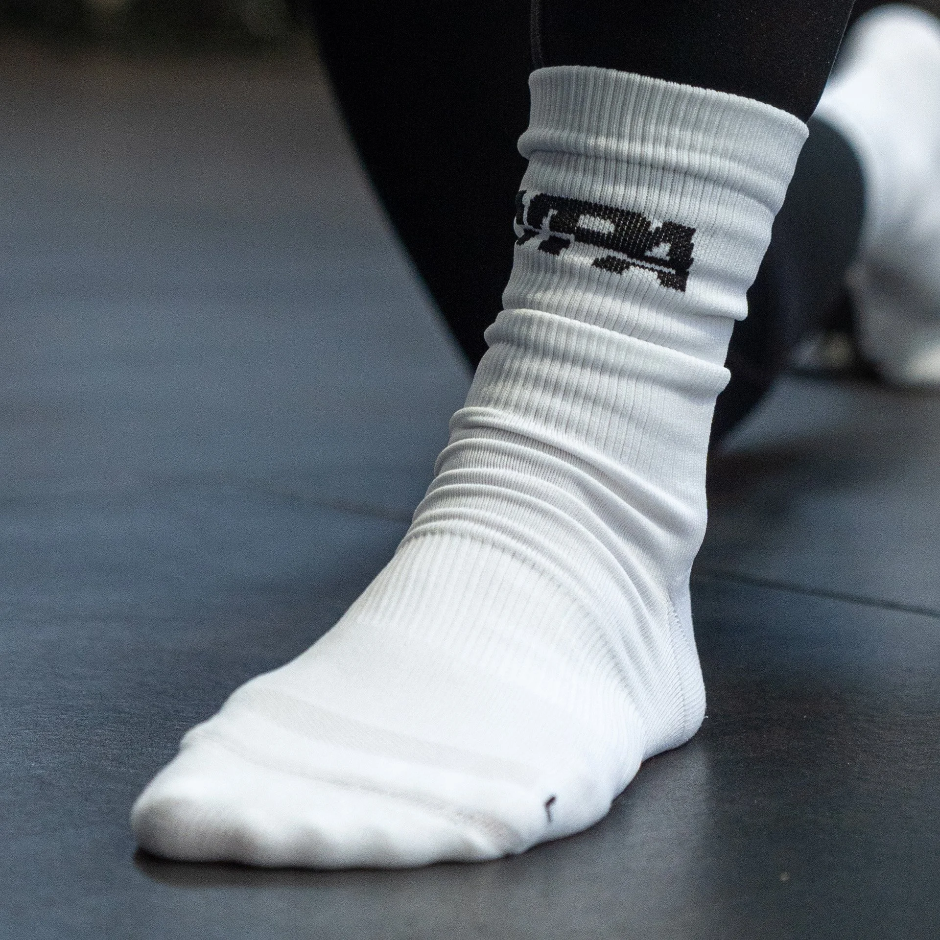
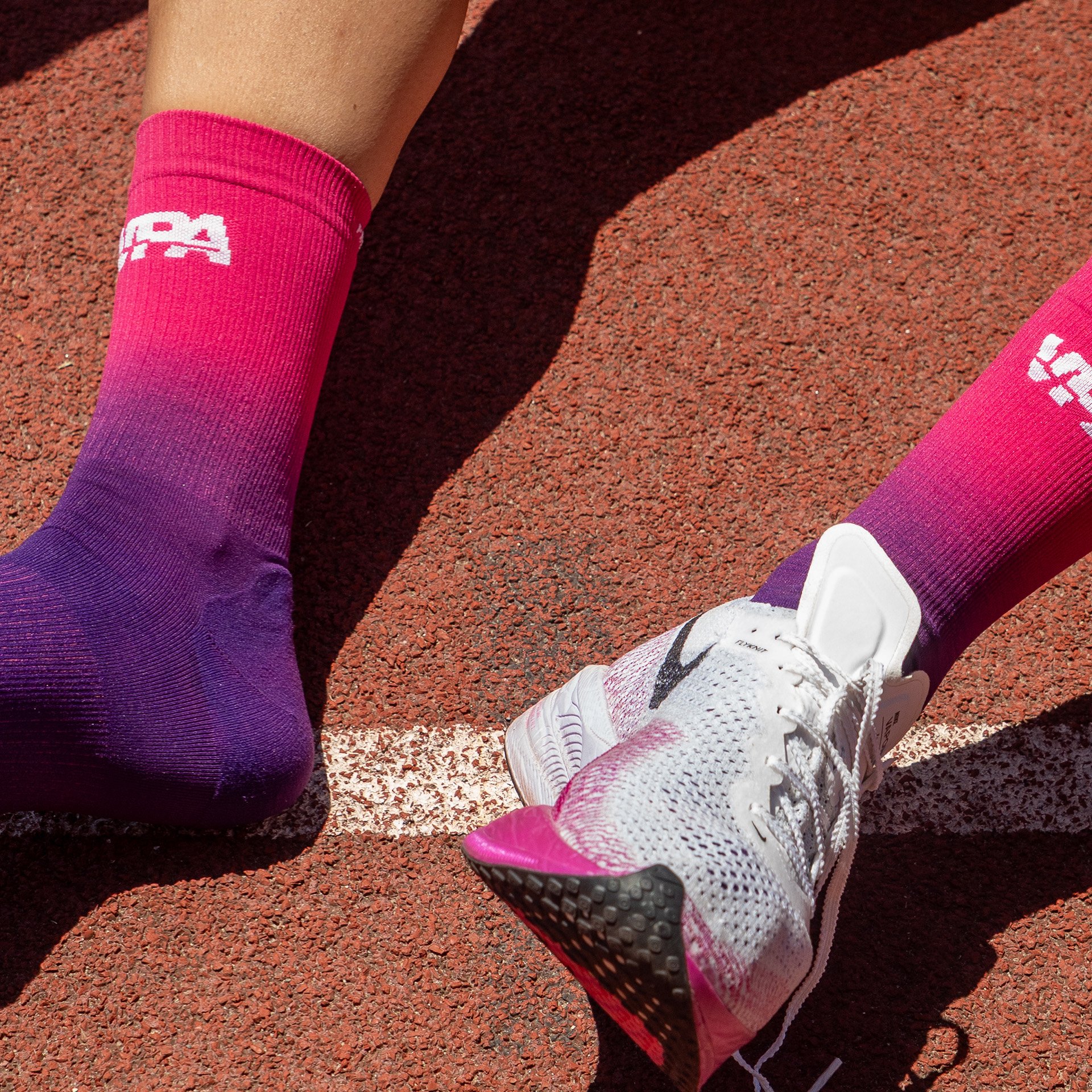
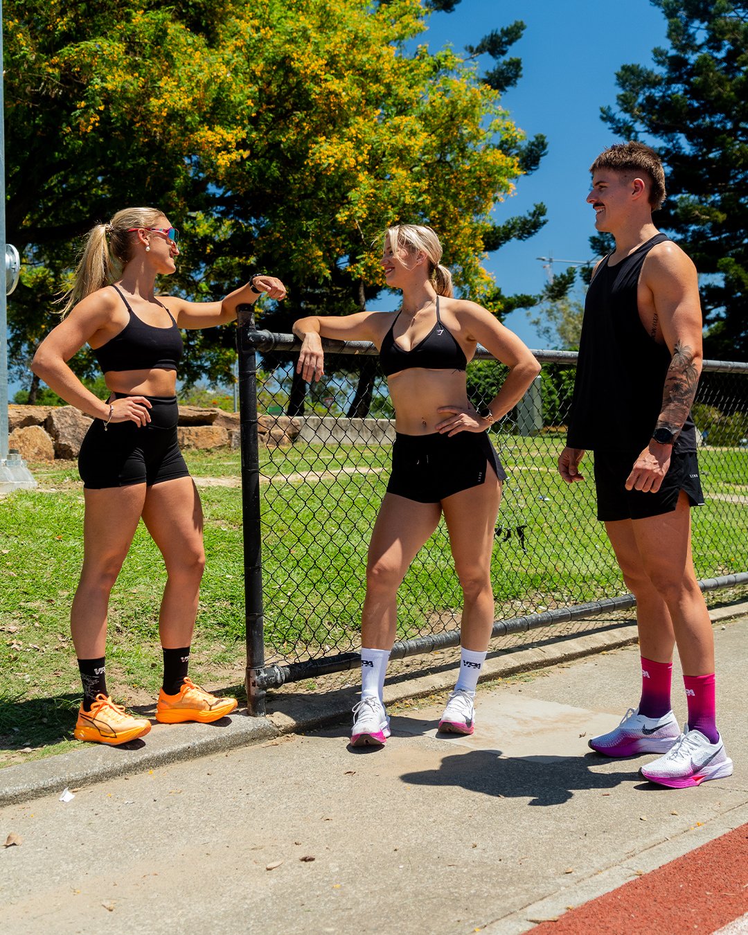
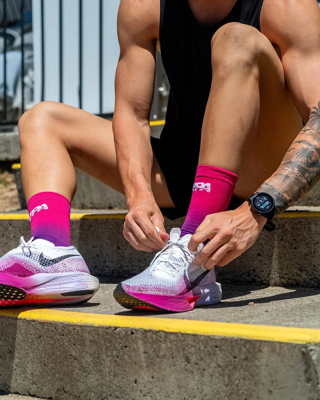
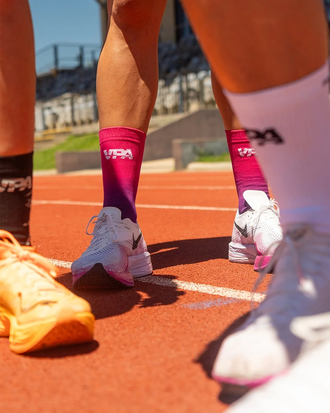
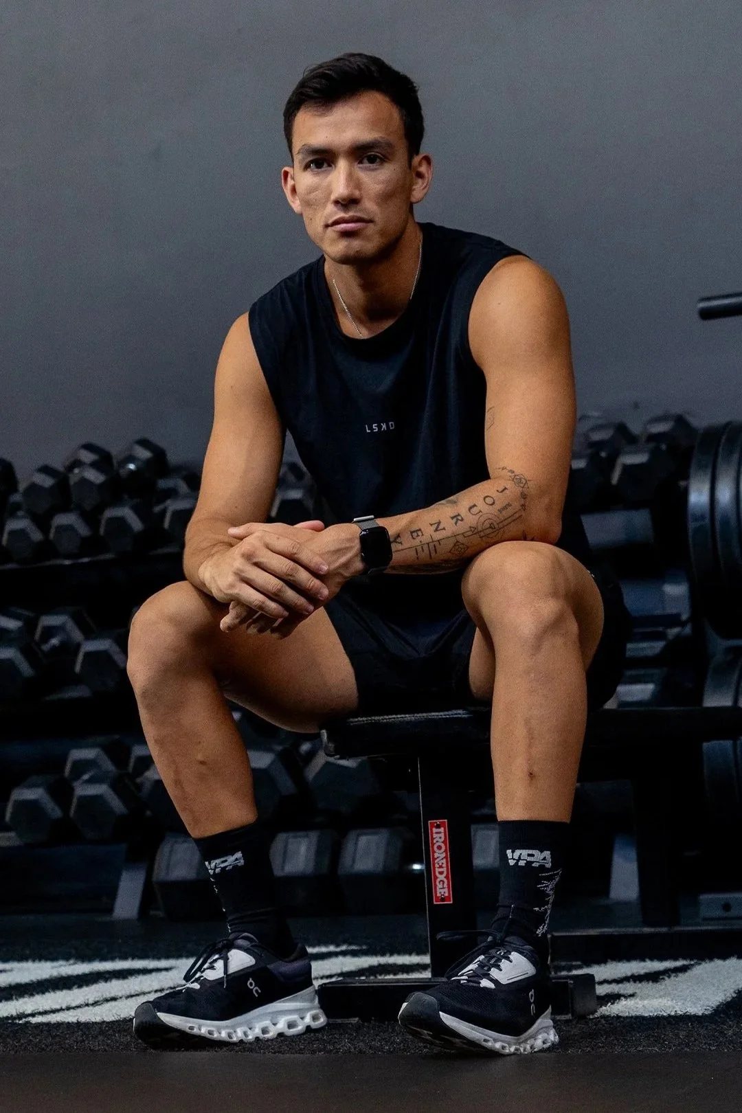
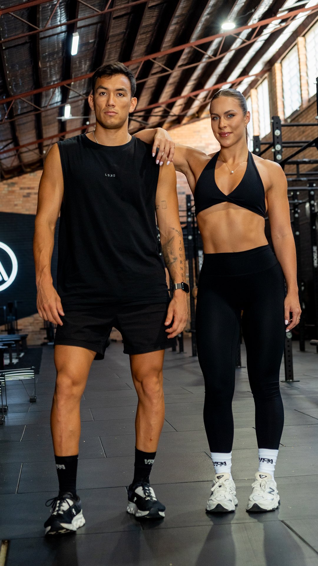
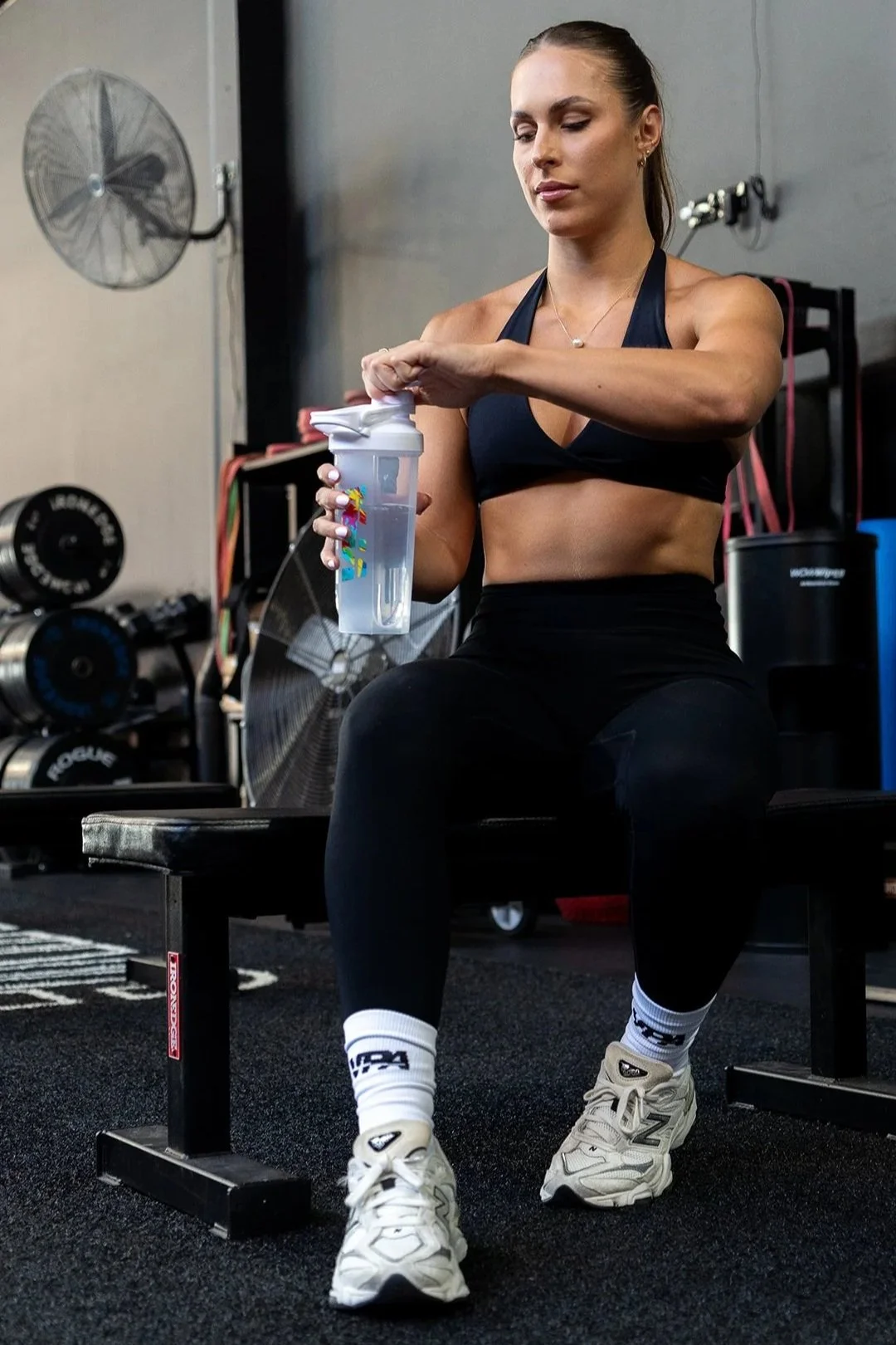
The range launched in three colourways: white, black with grey wing detailing, and a gradient pink/purple. White and black covered the everyday, versatile, easy to wear, easy to sell. The gradient was the swing. Research showed pink and gradient tones moving fast across performance wear, and almost no one in the sock category had gone there yet. That made it a trend call and a market gap at the same time. The same research showed male endurance athletes leaning into bold designs as much as female athletes, so the colourway worked harder than it might look.
Branding was minimal by design: Push Beyond Limits on the back calf, VPA logo at the front. Jacquard construction kept the logo looking like it belonged on the sock, not just on it.


Deliverables
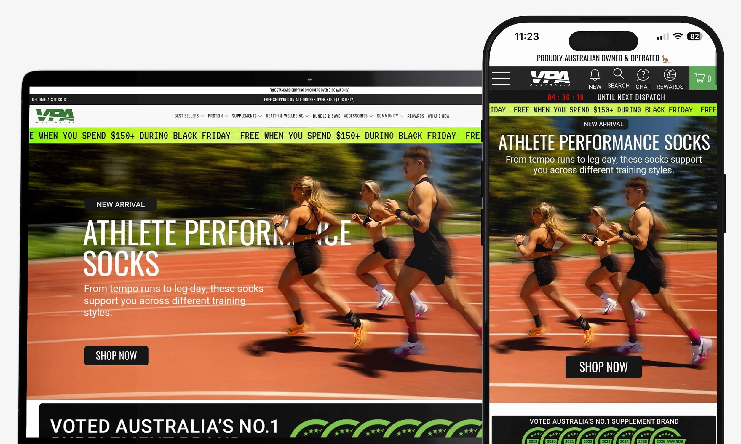
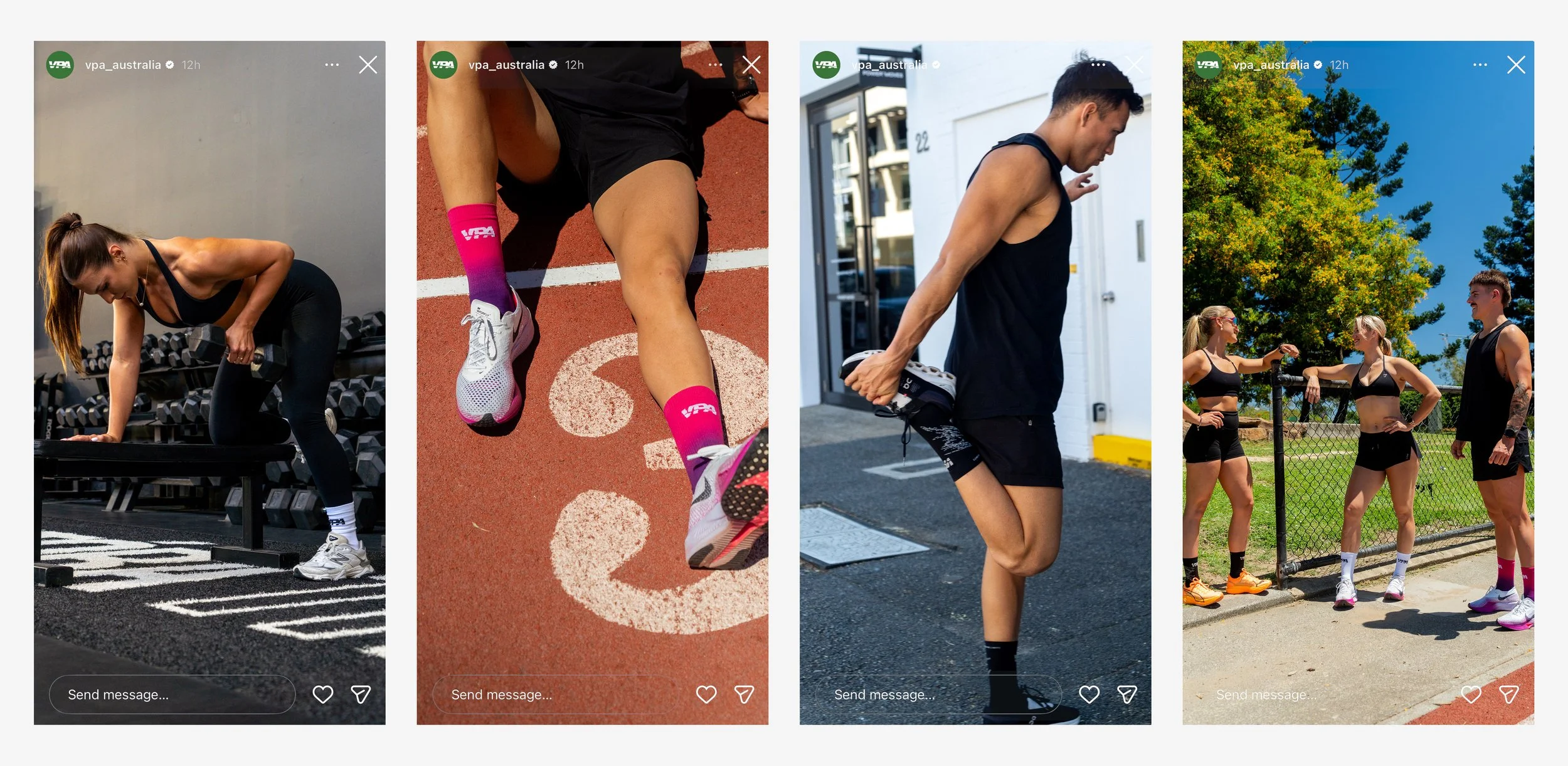
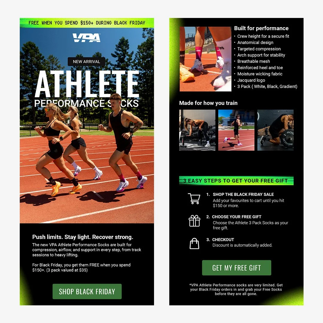
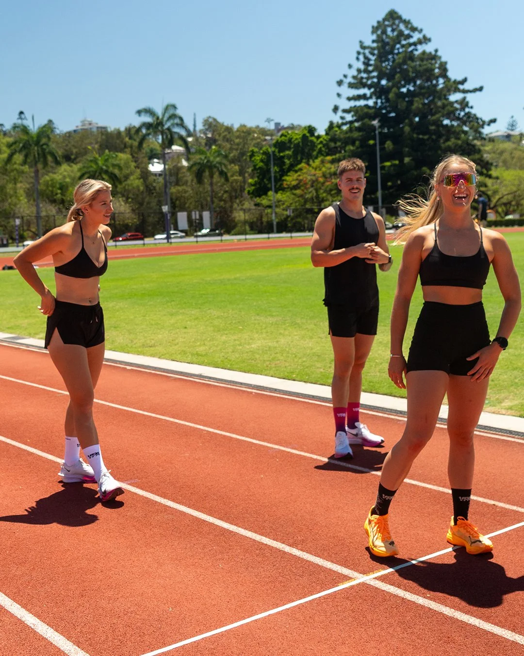
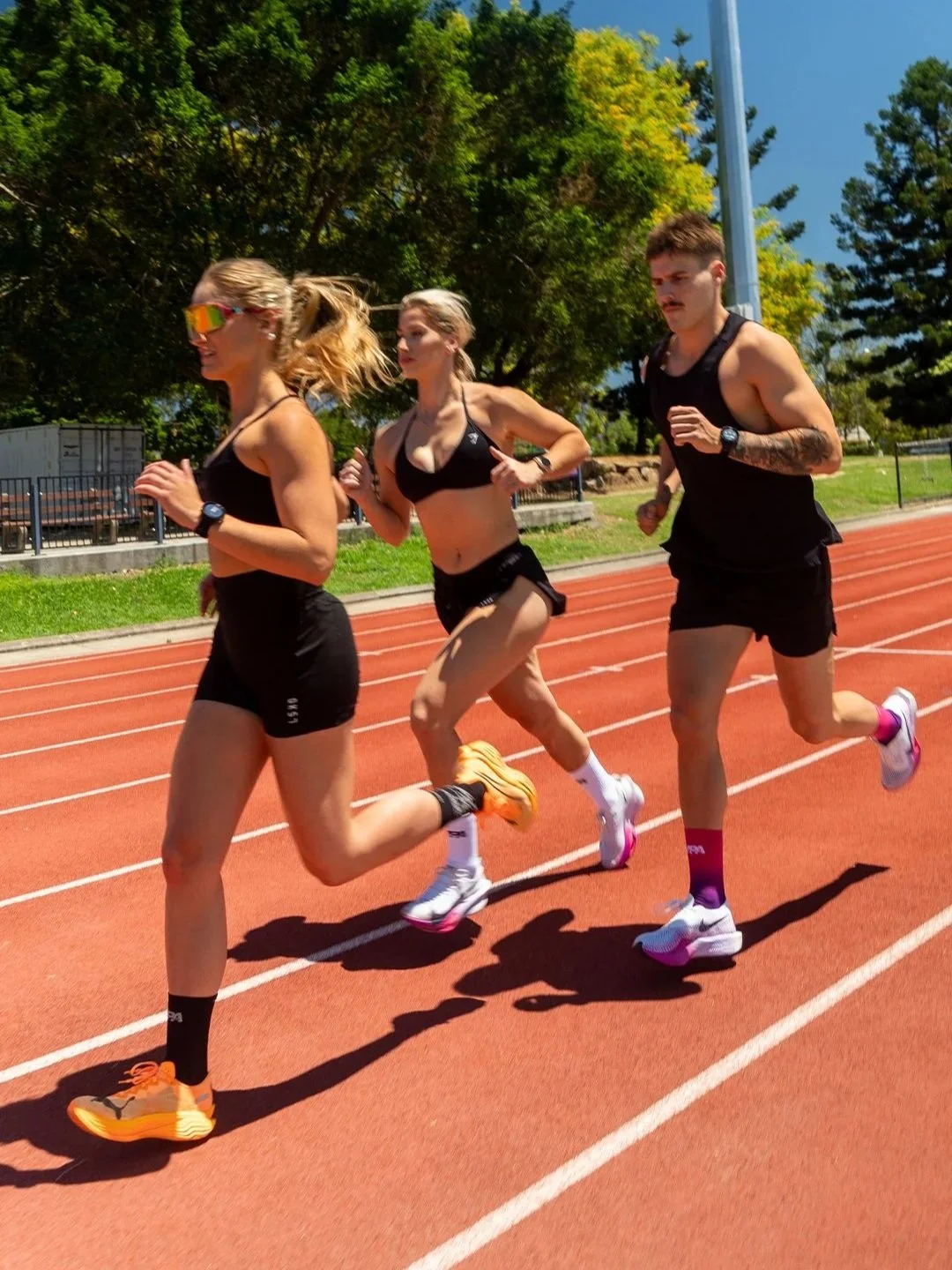
The product launch extended across the full digital touchpoint stack: Instagram and Facebook feed and stories, a launch EDM (copy and layout), and a Shopify homepage hero banner in both desktop and mobile. All photography was shot and directed in-house. Everything was built around the product and the colourways, consistent in voice and visual direction from email through to social.